[Return to syllabus
page]
Statistics 200: Lab 3 (Friday 30 Janurary
98)
Today's
tasks:
Fancier graphics: beyond the defaults. Multiple plots per
page, split screens, "graphics frames".
Splus has some very powerful built-in graphics tools. A great feature
of Splus is that you can construct your own graphics functions and customize
your plots to do exactly what you want. Today we shall construct our own
graphical tool.
We have saved some Census data in the Stat200 library (in the section
called nhcensus. You should attach that section of the library to
get access to the data set nhages, which is a list. ( See  HELP
if you have forgotten about libraries.)
HELP
if you have forgotten about libraries.)
The data gives counts for New Haven population, broken down by race,
sex, and agegroups. (Here is the html
version of the file, as it came from the Census lookup page. Don't try
to copy from the html; use the Stat200 library!)
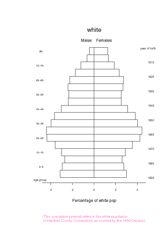
This week I want you to write a series of functions that generate
population pyramids (similar to this example
for Hartford County) for the New Haven data.
Problem 1
Write a function to construct a population pyramid for white population
of the town. The plot should represent percentages of the population for
the various age groups, with females on one side of the central vertical
axis and males on the other. Hint: The barplot
command will be very useful (Look at the various optional arguments to
barplot. You should find ways to
tip a barplot on its side, to make bars stick out in two directions, and
other exciting variations!)
Problem 2
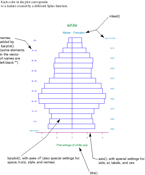
Improve your function from Problem 1:
-
make sure the ages increase from the bottom of the pyramid.
-
make the axis show percentages of population increasing in both directions
away from the central vertical axis.
-
add a title
-
fill in any gaps between the horizontal bars
-
make sure any labels fit on the page
Some hints: The par command is
used to change many of the graphical parameters in Splus, it has many arguments.
The Splus help file for par is
overpowering and we have included a more simple form of the file here (see
remarks on the dreaded par()).
You will need the commands: axis
and pretty to do some of Problem
2; Check here for more
hints.
Problem 3
Improve your function from Problem 2: group the population into 5 year
age ranges, 0-4 years, 5-9 years, and so on. Redraw the pyramid. Hint:
?paste, ?rep,
?tapply. Also, try this little
experiment, to see one way of collapsing categories:
indices <- rep(1:6,c(3,4,2,6,2,2))
full <- 1:length(junk)
squished <- tapply(full,indices,sum)
Now use paste() to make suitable labels for the squish values.
Problem 4
Write a function to draw three little population pyramids in a row: white,
black, hispanic. Have a title on each pyramid, and a main title for the
plot. Hint: To divide the graphics screen into sections use the par
command (the mfrow argument) or
the split.screen command, I warn
you the split.screen command can
get confusing.